The building blocks of web design, divs can be styled to give an almost unlimited number of possibilities for designing your web site. Have you ever seen the kids' puzzle game where you have a box that is filled with squares and rectangles all nestled inside? The object is to dump the contents out of the box, swirl them around, and then try to fit them all back inside. Building a web page layout is putting together several blocks, each called a div, so they all fit well together.
In the example below, this simple, typical web page layout consists of four blocks. The first division block is the Header that sits at the top of the page; the second is the main content area; the third is the left hand sidebar; the fourth is the footer.
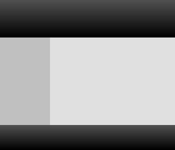
You will place all of the content that shows on the screen within the <body> ... </body> tags. So our basic page with the four "building blocks" shown in the image above will look like this:
Because your site will consist of several <div> ... </div> groups, some may be used only once on a page and others may be used several times.
Some items like the content block are only used once on each page. Unique items need a unique name. We do that by giving them their own identifier, or ID for short. In CSS, an ID begins with the # symbol.
By default, a div will expand in width to 100% of whatever block contains it. This causes divs to sit one on top of each other. To have divs sit side by side on the page, you can specify a width and a float to each div.
In HTML5, header, footer, and aside (instead of sidebar) are HTML selectors. You need to set them as block level elements to be cross-browser compatible. You will add the following to your css file:
The float property can be applied to divs and accepts the value of right, left, or none. To have your content and sidebar areas sit side by side, the css coding looks similar to the following:
Your CSS boxes can not only have a width and height, they can also be told where to appear. You can position a box by specifying its location something like this:
This would place the top left corner of the box at precisely 50 pixels down from the top of the screen and 150 pixels over from the left side of the screen. (You can also position top and right, bottom and left, and bottom and right.) This is kind of like placing sticky notes on the refrigerator.
But web pages aren't static. They are viewed by a wide variety of different computers with a range of screen resolutions. We can be more precise if we also use relative positioning.
NOTE: With the popularity of reponsive web design, we will rarely position elements on a page. But if you are not familiar with the concept, it is good to know.
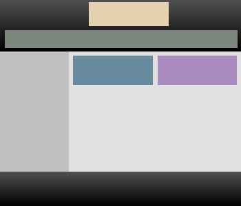
In the example below, assume that we have two elements we need to place within the header area of our web page. The green area is for links, and the yellow area is for the logo and site name.
We can have these two items sit on top of our header by assigning a relative position as follows:
Now we can position other divs inside of the header by using absolute positioning as follows:
For the #toplinks ID, the position is set relative to the header so it sits 80 pixels down from the top and 20 pixels over from the left side. To keep elements from running into each other, each can be put on its own "layer" by using the z-index property.
The #sitename ID is also positioned relative to the header so it sits 10 pixels down from the top of the screen and 300 pixels over from the left of the screen. It also occupies its own layer.