Before we can move on to discuss margin and padding values, it is important to first understand the Box Model and how it affects CSS.
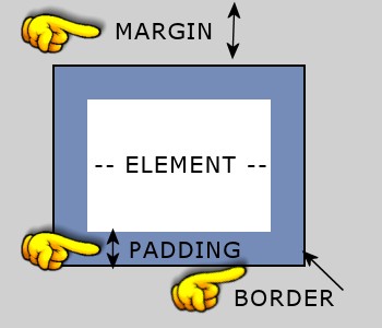
This is an example of a box with different color areas showing the various regions that can be formatted. Each block level tag has four sides that can be specified in order going clockwise beginning at the top. Every box element can have a width and height defined, as well as a margin, border, and padding to all four sides.
Width and height properties accept a length value, a percentage value, or auto (which leaves the dimensions up to the browser.) An example is as follows:
A block-level element may contain other block-level elements, or it may contain inline elements. But inline elements cannot contain block-level elements, only data or other inline elements. So a block-level element is "bigger" or "higher" in the hierarchy. It defines a larger section of of the page than an inline element does.
 Block-level elements generally begin on new lines. In practice, most browsers insert a
blank line between any two block-level elements. So if you have a paragraph (block-level),
and you end that paragraph and begin another paragraph, there will be blank line between
them. Same thing between a header and a paragraph, between two headers, between a
paragraph and a list, between a list and a table, etc. This is a useful clue as to what a
block-level element is.
Block-level elements generally begin on new lines. In practice, most browsers insert a
blank line between any two block-level elements. So if you have a paragraph (block-level),
and you end that paragraph and begin another paragraph, there will be blank line between
them. Same thing between a header and a paragraph, between two headers, between a
paragraph and a list, between a list and a table, etc. This is a useful clue as to what a
block-level element is.
Inline elements do not start on a new line. If you type out a paragraph, and decide to
make one of the words italic, does the browser jump down a line for the italic word? No,
it doesn't and this is a clue as well. The italic tag is an inline tag. So is bold,
strong, em, a href, etc. None of these tags causes the browser to start a new line, so
these are all inline elements.
If you are wondering why this discussion on block-level elements is important, you will understand after reading through this example:
Assume that you have purchased a template and the page layout is contained within a <div> called "wrapper" or "container". This div is set to a width of 900 pixels. A div is a block-level element.
Inside of this wrapper are two other divs, one for the sidebar and one for the content. You decide you need for the sidebar to be just a bit narrower and the content to be a bit wider. How do you make this change?
Here's a peek inside the CSS file (don't worry if you don't understand it all at this point):
The sidebar has a width of 270 pixels and the content has a width of 600 pixels. For the math wizards, you will see that this does not add up to 900 pixels! It's only 870 pixels.
Now look at the padding values and you will see there are pixel values. Remember that values are listed clockwise starting at the top. All you are concerned about are values affecting the width.
The sidebar has a 30 pixel value added to the right side. Add this 30 pixel value to the sidebar's width and you have 300 pixels. The content has no values added for the left and right sides, so its total width is still 600 pixels.
Add the two together and you come up with 900 pixels that exactly matches the 900 pixel width of the wrapper. It's a perfect fit.
To change both the sidebar and content div width, make adjustments so that all width values still equal 900 pixels.
The same method applies if your content and sidebar areas are set in percentages rather than pixels. Do the math so that all values do not exceed 100%.
Sometimes there may be a circumstance where it is difficult to determine the correct percentages for margins and paddings. You can overwrite the way the box model works with a bit of CSS. To maintain a specific width with margins or paddings, set width and add:
This works very well, but only has one disadvantage if you are using Expression Web or Dreamweaver. The box-sizing is only rendered in the browser and not in Design View of your web editor. It causes the content blocks to distort with some dropping below rather than sitting beside another block. For more advanced userrs it isn't a problem. For the novice or casual user who relies on a more accurate Design View, it is confusing.
Your mileage may vary so be sure to preview often to make sure you are getting the desired results. But it's a handy CSS tip to know.