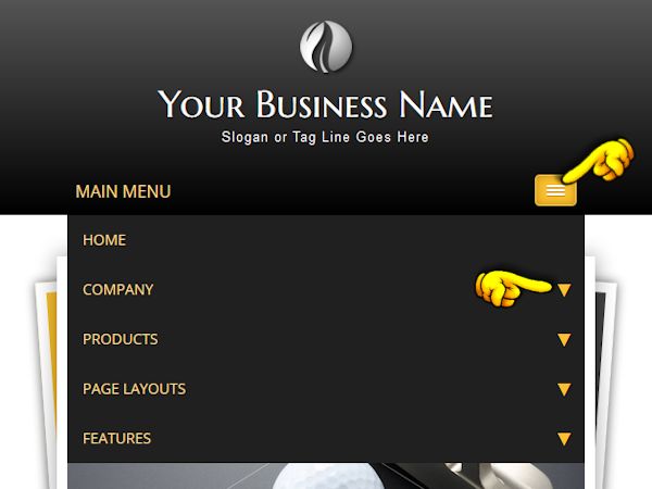
The navigation menu can hold a main topic and up to two sub-topic levels. The sub-topic level will expand on mouseover and will contract when you move the mouse off the menu item.

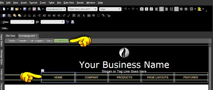
You can delete main topics (and any associated sub-topics), add new ones, and change the text and links on the existing menu. You will edit the drop-down menu on the .dwt page templates. Note that the subtopic levels will not be visible, so you will need to edit the menu in code view. If you look at the coding, it should be relatively easy to make your changes.
For a main topic (top link) only, your code will look something like this:
For a sub-level of links, take note of how the second <ul> group sits before the closing </li> tag. your code will look something like this:
For a second sub-level of links, again note how the <ul> group is nested. Your code will look something like this:
Once you have your menu completed on one .dwt page, copy the entire menu and paste it into any additional .dwt page templates you will be using. Save your pages and allow the changes to update on the .html pages. Save and you're done.
If you are using Expression Web or Dreamweaver, it's easy to copy your changes to the other .dwt template pages you will use. Click in the navigation area on the .dwt template, then look on the quick tag selector bar. Highlight the selector and you will see that the menu is now highlighted. Copy (Control + C) and open any other .dwt templates. Once again highlight the <ul.slimmenu> selector in the quick tag selector bar and paste (Control + V) over the old navigation group with your new one.
Font sizes and colors, background colors, sub-topic block width, margins, paddings, etc. are all controlled in the default.css page.
If the navigation bar contains top-level links that are of varying widths (the width of the link text), there may be enough room to just add another link to the coding. If it will not fit, then you will have to experiment with the CSS file to either reduce the <li> width, the font size, and/or adjust margins and paddings:
Note: This is a more complex menu. In the CSS file, there are some lines that are marked as "do not edit". Of course you can edit them, but be warned you need to understand what changes you are making. If you need to tweak the non-mobile menu, I would recommend you copying the original code for safe keeping.
The drop-down portion of a top-level link will expand to hold the sub-menu links. In theory, this is great; in practice, there are limits. Add too many links and the menu will expand and drop below the visible screen area. Moving the mouse to scroll the page will cause the menu to collapse.
Whether you are trying to link to product pages, tutorials (like this site), or have a list of members, you want your visitors to find the information they need. A long display of link choices can be difficult to read. You really don't have to display everything in your main menu.
You have probably heard the old saying that 20% of your products make up 80% of your sales. So if you have a lot of links in one section, consider placing the most popular 15 or so. Then add a last link that says "View More". Link the view more to a site map or similar page. Large sites always benefit from having a site map because you want visitors to get past your home page.
Give it a try. You will probably find your visitors will stay longer if they are not overwhelmed with a vast number of menu choices.
The mobile menu kicks in at a certain screen width. This width is set in the code in the .dwt template pages. You can edit this width, but please take care when doing so.